
Teal and grey aren’t just trending, they’re practical. This color combination delivers visual interest without the commitment of bolder, harder-to-live-with palettes. Teal brings energy and depth, while grey grounds the space and plays well with almost any accent color down the line. Whether someone’s repainting an outdated beige box or refreshing a builder-grade rental, this pairing works across lighting conditions and furniture styles. It’s forgiving for DIYers who aren’t designers, and it photographs well if resale is on the radar. Here’s how to pull it off without turning a living room into a showroom that nobody actually uses.
Table of Contents
ToggleKey Takeaways
- A modern teal and grey living room combines visual interest with practicality, delivering a palette that feels current without appearing trendy or demanding.
- Match undertones carefully—pair blue-leaning teal with cool grey (slate or blue undertones), or green-leaning teal with warmer grey tones—and always test paint samples under different lighting conditions.
- Apply the 60-30-10 color rule: 60% dominant color (grey), 30% secondary (teal), and 10% accent colors to avoid visual chaos while maintaining intentional design.
- Start with foundational elements (walls, flooring, large furniture) before adding accents; one accent wall in teal with remaining walls in grey is the safest approach for DIYers.
- Layer textures, metals, and lighting to prevent a sterile look—use warm white bulbs (2700-3000K), mix matte and gloss surfaces, and incorporate wood tones to add warmth.
- Bring in teal through flexible accent pieces like throw pillows, curtains, and artwork rather than permanent wall color to maintain design adaptability, especially for renters.
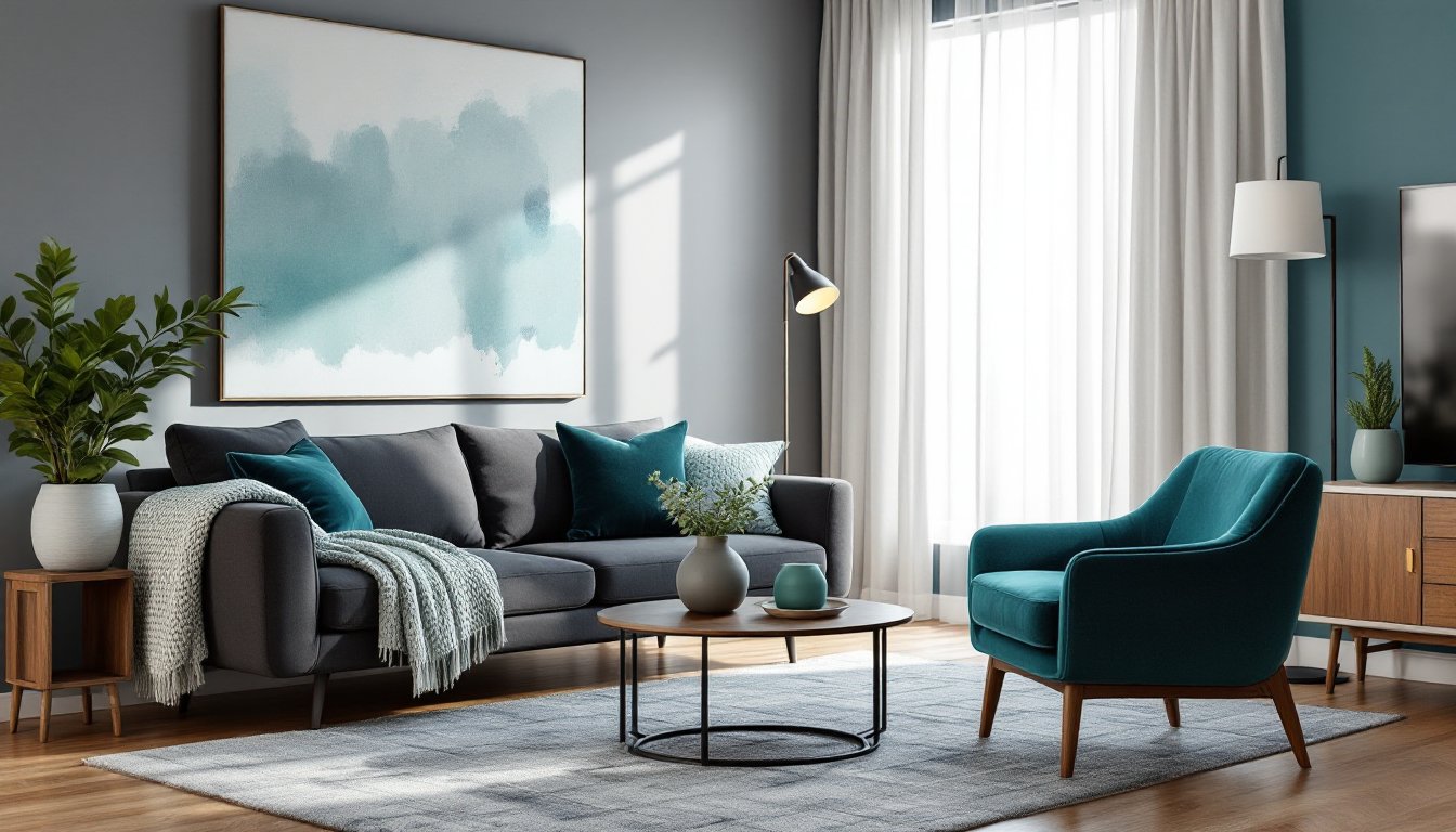
Why Teal and Grey Work Beautifully Together
Teal sits between blue and green on the color wheel, which means it reads as cool but not cold. Grey, being neutral, doesn’t compete, it supports. The result is a palette that feels modern without skewing trendy, and calming without being boring.
From a practical standpoint, grey hides wear better than white or beige, especially in high-traffic living rooms. Teal adds enough color to make the room feel intentional, but it’s not as demanding as jewel tones or primaries. If someone’s working with north-facing windows (which tend to cast blue-grey light), this combo can actually enhance that natural tone rather than fight it.
The pairing also offers flexibility. Grey works as the dominant color with teal as an accent, or vice versa. That makes it adaptable to different room sizes, furniture inventories, and commitment levels. Someone renting can bring in teal through textiles and decor, while a homeowner might go all-in with painted walls or reupholstered seating.
Choosing the Right Shades of Teal and Grey
Not all teals and greys play nicely together. The key is matching undertones. Teal can lean blue (cooler) or green (warmer). Grey can skew blue, purple, or even brown depending on the pigment base. Mismatched undertones make a room feel off, even if someone can’t pinpoint why.
For a cohesive modern look, pair a blue-leaning teal with a cool grey that has blue or slate undertones. Sherwin-Williams’ “Reflecting Pool” (teal) works well with “Repose Grey” or “Comfort Grey.” If the teal leans more green (like Benjamin Moore’s “Gulf Stream”), choose a warmer grey with slight green or taupe notes, “Revere Pewter” is a solid pick.
Test paint samples on at least two walls, one that gets direct light and one that doesn’t. Paint colors shift dramatically depending on natural and artificial light. A teal that looks vibrant in the store can read murky in a dim living room, and a grey that seems perfect at noon might turn lavender under LED bulbs at night.
For furniture and textiles, stick to a 60-30-10 rule: 60% dominant color (often grey), 30% secondary (teal), and 10% accent (white, black, brass, or wood tones). This prevents the room from feeling too matchy or visually chaotic.
Foundational Design: Walls, Flooring, and Large Furniture
Start with the largest surfaces. If painting walls, one accent wall in teal with the remaining three in grey is the safest move for most DIYers. It delivers impact without overwhelming the space. Use a satin or eggshell finish for living room walls, flat paint shows every scuff, and semi-gloss reads too commercial unless it’s trim.
Primer matters. If covering a dark or bold existing color, use a grey-tinted primer to reduce the number of topcoats needed. Standard primer works for light-to-light transitions. Two coats of quality paint (like Behr Marquee or Benjamin Moore Regal Select) typically provide full coverage. One gallon covers roughly 350-400 square feet, so measure wall area (length × height, minus windows and doors) before buying.
For flooring, grey works better than teal, nobody wants a statement floor that dictates every future design decision. Luxury vinyl plank (LVP) in a grey or greige wood-look pattern is durable, water-resistant, and DIY-friendly. It typically runs $2-4 per square foot for mid-grade options. Traditional hardwood in grey stain is pricier ($6-12 per square foot installed) but adds resale value. If existing flooring is oak or another warm wood, a large grey area rug can bridge the gap without a full floor replacement.
Large furniture should anchor the palette. A grey sectional or sofa in a performance fabric (stain-resistant, tight weave) is practical for real-life use. Teal works well for a statement chair or ottoman. Avoid matching sets, modern design thrives on intentional variety, not uniformity.
Accent Pieces That Bring Your Color Scheme to Life
Accent pieces are where DIYers can experiment without permanent commitment. Teal throw pillows, blankets, or curtains are easy swaps that deliver instant impact. Look for fabrics with texture, linen, velvet, or boucle, rather than flat cotton. Texture adds depth and keeps the room from reading one-dimensional.
Curtains should skim the floor and mount as close to the ceiling as possible to elongate walls. A teal panel on a grey wall (or vice versa) works well. Use a 1.5-inch diameter rod for a modern look, thin rods feel dated. Blackout lining is worth the extra $10-15 per panel if western sun blasts the room.
Artwork and wall decor should pull from both colors without being too literal. Abstract pieces with teal and grey tones, plus a third color (mustard, blush, or black), add sophistication. Oversized art (30×40 inches or larger) makes a stronger statement than gallery walls of small frames. When hanging, the center of the artwork should sit at 57-60 inches from the floor, standard gallery height.
Planters, vases, and decorative objects in matte teal ceramic or grey concrete fit the modern aesthetic. Sources like contemporary design retailers often feature small-batch items that elevate a room beyond big-box store offerings. Plants themselves, pothos, snake plants, fiddle leaf figs, add organic contrast to the cool palette.
Textures and Materials for a Modern Look
Modern design relies on varied textures to avoid feeling sterile. Mix matte, gloss, soft, and rough surfaces. A grey linen sofa pairs well with a teal velvet chair. A glossy teal side table contrasts with a matte grey wall. A jute or wool rug grounds slick surfaces like metal coffee tables or glass shelving.
Metal finishes matter. Brushed nickel, matte black, and brass all work with teal and grey, but pick one dominant metal and stick with it for hardware, light fixtures, and furniture legs. Mixing too many metals looks unintentional rather than curated.
Wood tones add warmth. Walnut and oak in medium to dark stains prevent the room from feeling cold. A walnut media console or oak coffee table breaks up the grey-teal monotony without clashing. Avoid glossy, orange-toned wood (common in older furniture), it fights cool palettes.
For window treatments and upholstery, performance fabrics like Crypton or Sunbrella are worth the upcharge if kids, pets, or heavy use are factors. They resist stains and moisture without looking industrial. Natural linen and cotton work for low-traffic accent pieces but require more maintenance.
Lighting and Accessories to Complete the Space
Lighting can make or break this palette. Cool-toned LEDs (5000K+) can push grey toward blue and make teal look washed out. Stick to warm white bulbs (2700-3000K) for living spaces, they add warmth without distorting color.
Layered lighting is key. Overhead fixtures (flush-mount or semi-flush for standard 8-foot ceilings) provide general illumination. Add floor lamps or table lamps with grey or teal bases for task lighting. Aim for at least three light sources in a living room to avoid harsh shadows or flat lighting.
Dimmer switches are an easy DIY upgrade, most install in under 30 minutes with a screwdriver and wire stripper. Make sure the dimmer is compatible with LED bulbs (not all are). Turn off power at the breaker before touching any wiring. If someone’s not comfortable with electrical work, this is a $100-150 job for an electrician.
Accessories should feel intentional, not cluttered. A few well-chosen items, sculptural bookends, a modern clock, a ceramic bowl, beat a shelf crammed with tchotchkes. Resources like architectural and design publications showcase how restraint creates impact in modern interiors.
Mirrors amplify light and make small rooms feel larger. A large rectangular or round mirror with a thin metal frame (black or brass) works well over a sofa or console. Mount it at eye level, not near the ceiling.
Conclusion
Teal and grey deliver a modern, livable palette that doesn’t require a design degree to execute. Start with the big decisions, wall color, flooring, and primary furniture, then layer in accents, textures, and lighting. Test paint samples, measure twice, and don’t skip prep work. The result is a space that feels intentional, current, and comfortable enough to actually use. For additional modern home decor inspiration, explore curated examples that translate editorial looks into real-world applications.