
Light blue isn’t just a color, it’s a mood. Calm without being cold, versatile without fading into the background, it gives living rooms a breathing quality that’s hard to beat. Whether you’re painting every wall or adding a single statement piece, light blue adapts to nearly any design direction: coastal, traditional, modern, even industrial when paired right. This isn’t about trend-chasing. Light blue has staying power because it plays well with natural light, doesn’t overwhelm smaller spaces, and pairs with a surprisingly wide palette. Here’s how to use it effectively, from choosing the right shade to finishing touches that pull the room together.
Table of Contents
ToggleKey Takeaways
- Light blue living room ideas work across multiple design styles—from coastal to modern—because the color reflects natural light, doesn’t overwhelm spaces, and has lasting design appeal beyond passing trends.
- Choose your light blue shade based on undertones: powder blue suits traditional spaces with warm woods, sky blue works in naturally lit modern rooms, and robin’s egg blue brings a cheerful coastal cottage vibe.
- Test paint samples on at least two walls in different natural light conditions for 48 hours before committing, and use eggshell finish as the ideal balance between aesthetics and durability for most living rooms.
- Layer multiple shades of blue, warm neutrals like cream and beige, and bold accents such as navy, coral, or mustard to prevent light blue walls from feeling flat or one-dimensional.
- Accessories including area rugs, throw pillows, warm-toned lighting (2700K–3000K), and natural wood elements create depth and warmth while complementing your light blue living room palette.
Why Light Blue Works So Well in Living Rooms
Light blue hits a psychological sweet spot. It registers as cool and calming, research shows blue tones can actually lower heart rate and reduce anxiety, but lighter values keep it from feeling stark or clinical. That makes it ideal for a living room, where you want people to settle in and stay awhile.
From a design standpoint, light blue reflects natural light better than saturated colors, which helps smaller or north-facing rooms feel more open. It doesn’t compete with furniture or artwork the way bold colors can, so your room’s focal points, an heirloom rug, a gallery wall, a killer sectional, get to shine.
It’s also forgiving with wear and tear. Light blue doesn’t show scuffs or wall marks the way white does, and it hides uneven surfaces better than deep, glossy finishes. If you’ve got textured drywall or older plaster walls, a matte or eggshell light blue is your friend.
Finally, light blue ages well. Unlike trendy accent colors that look dated in three years, light blue has been in play since the colonial era. It doesn’t scream a particular decade, which means you won’t need to repaint the moment design winds shift.
Choosing the Perfect Shade of Light Blue for Your Space
Not all light blues are created equal. The difference between powder blue, sky blue, and robin’s egg can make or break a room, and it comes down to undertones.
Powder blue has gray or violet undertones. It reads softer and more neutral, which pairs well with traditional furniture and warmer woods like oak or walnut. If your living room gets limited natural light or faces north, powder blue won’t turn icy.
Sky blue leans clean and crisp, with minimal gray. It works in rooms with plenty of natural light and pairs beautifully with white trim and modern furniture. Be cautious in rooms with cool artificial lighting, sky blue can feel sterile under daylight LEDs.
Robin’s egg blue brings a hint of green (it’s technically a blue-green). This is your coastal or cottage pick. It’s cheerful without being juvenile, and it pairs naturally with warm neutrals like sand, cream, or driftwood gray.
Test before committing. Buy sample pots (Benjamin Moore, Sherwin-Williams, and Behr all offer 8 oz testers) and paint 2’×2′ squares on at least two walls, one that gets direct light and one that doesn’t. Live with them for 48 hours and check them in morning, afternoon, and evening light. What looks perfect at noon might turn baby-nursery at dusk.
Consider your trim color, too. Light blue with bright white trim feels crisp and modern. Pair it with off-white or cream trim for a softer, more traditional vibe.
Light Blue Walls: Paint Techniques and Accent Options
Painting a living room light blue is straightforward, but a few techniques elevate the result.
Prep Work Matters
Start with clean, dry walls. TSP (trisodium phosphate) or a deglosser removes grime and oils that prevent paint adhesion. Fill nail holes and cracks with spackle, sand smooth with 120-grit paper, then prime. If you’re covering a darker color, tinted primer saves you a coat of finish paint. Skip the primer and you’ll see bleed-through, especially with reds, deep greens, or browns underneath.
Paint Finish Selection
Matte or flat finishes hide wall imperfections and give a soft, sophisticated look, but they’re harder to clean. Good for low-traffic living rooms or homes without kids.
Eggshell offers a slight sheen and wipes down easily, ideal for family spaces. It’s the Goldilocks finish for most living rooms.
Satin is more durable and scrubbable, but it highlights every flaw. Only use it on perfectly smooth walls.
Apply two coats minimum. Light blue can look streaky or translucent in one coat, especially over white. Use a roller with a 3/8″ nap for smooth walls or 1/2″ for textured surfaces. Cut in (brush the edges) first, then roll in overlapping W-patterns to avoid lap marks.
Accent Wall Options
An accent wall works when the room has a natural focal point, the wall behind the sofa, a fireplace wall, or a built-in shelving unit. Paint it in a slightly deeper blue (one or two shades darker on the same paint strip) for subtle contrast, or go bold with navy or charcoal for drama.
Other accent options: board-and-batten wainscoting painted light blue with white panels, horizontal shiplap in a soft blue-gray, or wallpaper with a light blue pattern on one wall while keeping the rest neutral.
Furniture and Upholstery in Light Blue Tones
Light blue furniture makes a statement without shouting. A light blue sofa or sectional becomes the room’s centerpiece, but it’s surprisingly easy to live with.
Upholstery Fabric Choices
Linen in light blue looks relaxed and coastal. It wrinkles easily, which adds to the laid-back vibe but isn’t for everyone. It’s best in low-humidity climates since linen can feel damp in muggy conditions.
Performance fabrics (like Crypton or Sunbrella) resist stains and moisture, making them practical for families or pet owners. Many come in light blue shades and feel softer than older-generation performance textiles.
Velvet in powder blue or sky blue adds texture and a bit of luxury. It catches light beautifully and works in both traditional and glam interiors. Velvet shows wear patterns over time, so rotate cushions regularly.
Accent Chairs and Occasional Pieces
If a full light blue sofa feels like too much commitment, try accent chairs. A pair of light blue wingbacks or a single slipper chair adds color without dominating. Mixing a light blue chair with a neutral sofa keeps the room balanced.
Ottomans, poufs, and benches in light blue are low-risk, high-reward. They’re easy to reupholster or replace if you change direction later.
Wood Tones That Work
Light blue pairs well with natural oak, maple, and light walnut for a Scandinavian or modern farmhouse feel. For a more traditional look, cherry or mahogany adds warmth and richness. Avoid orange-toned woods like pine unless you’re deliberately going for a country cottage style.
Complementary Color Palettes That Enhance Light Blue
Light blue is flexible, but the colors you pair it with set the room’s entire personality.
Classic Neutrals
White and cream keep things airy and open. This is the fail-safe combo for small spaces or rooms with limited natural light. Use warm whites (with yellow or beige undertones) to prevent the room from feeling cold.
Gray in soft to medium tones pairs naturally with light blue. Cooler grays create a modern, almost Scandinavian look. Warmer greiges (gray-beige hybrids) soften the palette and add coziness.
Beige and tan warm up light blue beautifully. Think jute rugs, linen drapes, or a tan leather sofa against light blue walls.
Bold Accents
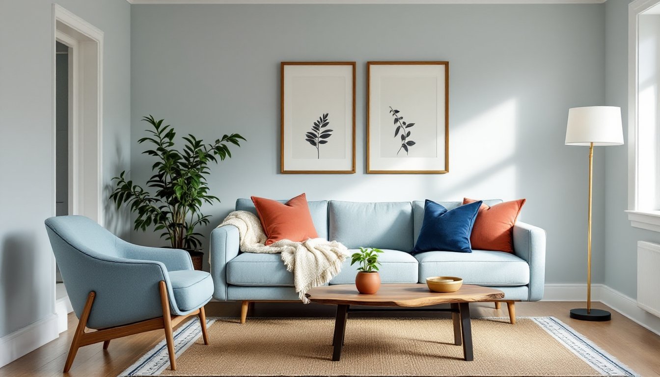
Navy blue creates depth and contrast. Use it in throw pillows, a patterned rug, or drapery to anchor light blue and prevent it from feeling washed out.
Coral or terracotta is the opposite of blue on the color wheel, making it a natural complement. A few coral accent pillows or a terracotta planter add warmth without clashing.
Mustard yellow brings energy and works surprisingly well with cooler light blues. Use it sparingly, a throw blanket, a pair of pillows, or artwork.
Metallics like brass, gold, or brushed copper add warmth and a bit of glam. Light fixtures, picture frames, or hardware in these finishes pop against light blue walls.
Layering Blues
Don’t be afraid to layer multiple shades of blue. Pair light blue walls with a deeper blue sofa, denim pillows, and a navy area rug. Varying the tones and textures prevents the room from feeling flat or one-note. Many design platforms like Homify feature layered blue interiors that demonstrate how different shades work together.
Accessories and Decor to Complete Your Light Blue Living Room
Accessories tie everything together. With a light blue base, you’ve got room to play.
Textiles and Soft Goods
Layering textiles adds warmth and depth. Start with an area rug, jute or sisal for texture, a patterned wool rug with light blue accents, or a solid in a complementary color. Rugs should be large enough that at least the front legs of your furniture sit on them (8’×10′ is standard for most living rooms).
Throw pillows are the easiest way to experiment. Mix patterns, stripes, florals, geometric, but keep a consistent color story. A good rule: use three pillow sizes (22″, 20″, and 18″) and vary textures (linen, velvet, cotton).
Throws and blankets in chunky knits, faux fur, or woven cotton add coziness. Drape one over the arm of the sofa or fold it in a basket.
Artwork and Wall Decor
Light blue walls are a gallery-friendly backdrop. Black-and-white photography pops, as do botanical prints and abstract art with warm accent colors. If you’re using frames, stick to one or two finishes, black, natural wood, or white, for a cohesive look.
Mirrors bounce light around and make the room feel larger. A large mirror with a gold or brass frame adds warmth and acts as a focal point.
Lighting
Lighting sets the mood. Table lamps with ceramic or wood bases in warm tones balance cool blue walls. Use LED bulbs in 2700K-3000K (warm white) to avoid a sterile, clinical feel. Floor lamps with adjustable arms add function and style.
Pendant lights or a statement chandelier draw the eye up. Brass, black, or natural materials like rattan or woven rope work well.
Plants and Natural Elements
Greenery brings life and contrast. Fiddle-leaf figs, snake plants, and pothos are low-maintenance and look great in white, terracotta, or woven basket planters.
Natural wood elements, floating shelves, a live-edge coffee table, or driftwood decor, add warmth and texture. Resources like Homedit often showcase how natural materials balance cooler paint tones in real living spaces.
Conclusion
Light blue gives a living room breathing room, literally and visually. It’s one of the most adaptable colors in the design toolkit, working across styles and spaces without demanding constant updates. Paint, furniture, or accessories, but you bring it in, light blue delivers calm, flexibility, and a foundation that grows with your space.