
Pink has shed its nursery-only reputation and claimed its place as a serious design choice for modern living rooms. From subtle blush undertones to vibrant coral statements, this versatile color brings warmth, sophistication, and personality to spaces that might otherwise feel sterile or predictable. Whether you’re planning a full renovation or looking for small-scale updates, integrating pink into your living room requires balancing tone, texture, and proportion. This guide walks through shade selection, furniture placement, complementary colors, and practical DIY projects to help you create a modern pink living room that feels intentional, not accidental.
Table of Contents
ToggleKey Takeaways
- A modern pink living room balances sophistication with warmth by combining pink walls with neutral furniture in charcoal, taupe, or oatmeal to create intentional, professional spaces.
- Test pink paint samples on at least two walls in different lighting conditions; blush and dusty rose work for subtle elegance while bold fuchsia and coral demand commitment as accent walls only.
- Pair pink with complementary colors like charcoal gray, sage green, navy, or terracotta to enhance biophilic design principles and prevent the space from feeling juvenile or accidental.
- Start with low-risk DIY projects such as accent walls, floating shelves, or reupholstered furniture to test pink before committing to full-room color application.
- Account for room size when selecting pink intensity—darker pinks make walls feel closer, so maintain proper furniture spacing and consider larger pieces to avoid a cartoon-like appearance.
- Metallic finishes matter: brass and copper warm blush tones, while matte black and brushed nickel offer more versatility with cool-toned pinks.
Why Pink Is the Defining Color for Modern Living Rooms
Pink’s resurgence in interior design stems from its ability to bridge minimalism and warmth. While neutral palettes dominated the 2010s, homeowners and designers increasingly recognize that stark white and gray schemes can feel cold or impersonal. Pink introduces softness without sacrificing sophistication, particularly when paired with natural materials like wood, stone, or linen.
The color’s psychological impact matters too. Pink reduces visual tension and creates an inviting atmosphere, making it ideal for spaces meant for relaxation and conversation. Unlike bold primaries that demand attention, pink recedes slightly, allowing furniture and architectural features to share the spotlight.
Current design trends favor biophilic interiors, spaces that connect occupants with natural elements. Dusty rose and terracotta-leaning pinks echo sunset tones and clay pigments, reinforcing this connection. Many modern home decor ideas now incorporate pink as a grounding color rather than an accent, signaling its evolution from trend to staple.
From a practical standpoint, pink works across lighting conditions. North-facing rooms that skew cool benefit from warm-toned pinks, while southern exposures handle cooler blush shades without washing out. This adaptability makes it easier to carry out than temperature-sensitive colors like pale blue or cream.
Choosing the Right Shade of Pink for Your Living Room
Selecting the right pink depends on your room’s size, natural light, and existing finishes. Paint chips lie, always test samples on at least two walls and observe them at different times of day. Most paint manufacturers sell 8-ounce sample jars for around $5-$8: apply two coats on a 2′ × 2′ section before committing.
Blush and Dusty Rose for Subtle Elegance
Blush tones contain enough gray to avoid looking juvenile or overly feminine. These shades work well in open-concept spaces where the living room connects to a kitchen or dining area. They provide color without creating harsh transitions between zones.
When painting, use a primer if you’re covering darker colors or new drywall. Blush shows imperfections more readily than deeper tones, so fill nail holes with spackle and sand smooth before priming. Two coats of quality paint (aim for 350-400 square feet per gallon coverage) typically deliver even color.
Dusty rose skews slightly more saturated than blush but maintains a muted quality. This shade complements mid-century modern furniture and works particularly well with walnut or teak wood tones. It also hides minor wall imperfections better than paler pinks.
Consider the sheen carefully. Eggshell or satin finishes balance washability with a soft appearance. Flat paint absorbs light beautifully but shows scuffs in high-traffic areas. Reserve semi-gloss for trim only, it reads too reflective on large wall surfaces.
Bold Fuchsia and Coral for Statement Spaces
Fuchsia demands commitment. Use it as an accent wall rather than coating all four walls, especially in rooms under 200 square feet. Painting the wall opposite your primary seating creates a focal point without overwhelming the space.
Prepare for more coats with saturated colors. Fuchsia and coral often require three coats over primer to achieve true color, particularly over existing whites or neutrals. Budget an extra 20% on paint quantity.
Coral works well in rooms with substantial natural light, as it can appear muddy in dim conditions. Test samples near windows and in corners farthest from light sources. If the color looks flat or brown in low light, opt for a shade with more pink and less orange.
Both fuchsia and coral pair best with crisp white trim and ceilings. The contrast sharpens the color and prevents the room from feeling cave-like. Use painter’s tape rated for delicate surfaces if your existing trim paint is older, low-quality tape or tape left on too long pulls up underlying layers.
Essential Furniture and Layout Ideas for a Modern Pink Living Room
Furniture selection either grounds a pink room or lets it drift into cartoon territory. Modern design emphasizes clean lines and proportional balance, which becomes even more critical when working with color.
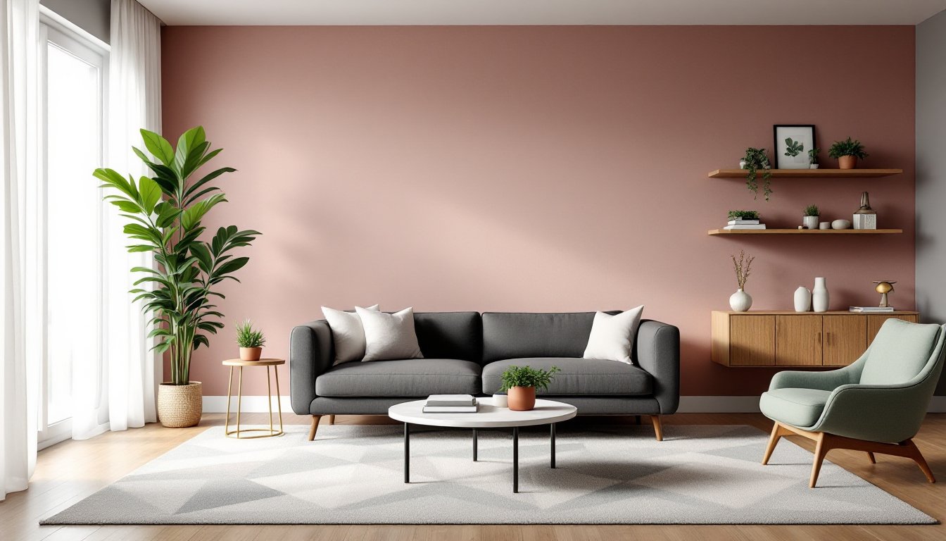
Anchor the space with substantial seating. A neutral sofa in charcoal, taupe, or oatmeal provides visual weight against pink walls. Avoid matchy-matchy pink upholstery unless you’re intentionally creating a monochromatic scheme, and even then, vary the textures. Velvet, linen, and performance fabrics in similar tones create depth.
Consider furniture scale relative to wall color intensity. Bold pinks require larger, heavier furniture pieces to avoid looking like accessories floating in a colored box. A sectional sofa or a substantial sofa-plus-two-chairs arrangement works better than a loveseat and scattered accent chairs.
Metal finishes matter. Brass and copper warm up blush and dusty rose but can clash with cool-toned pinks. Matte black or brushed nickel offers more versatility. If you’re keeping existing furniture with visible metal legs or frames, note their finish before finalizing your pink shade.
Layout principles don’t change, but color affects perception. Darker pinks make walls feel closer, so maintain adequate clearance, at least 36 inches between the sofa and coffee table for comfortable movement. In smaller rooms, angle furniture slightly rather than pushing everything against the walls to create a sense of space.
Rugs define zones in open layouts. An 8′ × 10′ or 9′ × 12′ rug should extend at least halfway under the sofa. Choose patterns that incorporate your pink shade plus one or two complementary colors. Geometric patterns reinforce modern aesthetics better than florals, though abstract designs work well.
Color Combinations That Complement Modern Pink
Pink plays well with unexpected partners when you understand undertones and temperature.
Pink and charcoal gray delivers sophistication. Use gray on large furniture pieces and in textiles like throw pillows or curtains. The combination reads contemporary without feeling cold, particularly when you add texture through wool, bouclé, or nubby weaves.
Pink and sage green taps into biophilic design principles. This pairing works especially well in spaces with indoor plants or botanical artwork. Many contemporary furniture collections now feature sage upholstery specifically to complement warmer wall colors.
Pink and navy creates crisp contrast. Navy grounds pink’s softness and adds masculine balance, useful if you’re working with a partner who’s skeptical about pink. Use navy in area rugs, built-in cabinetry, or accent chairs.
Pink and terracotta or rust builds a warm, layered palette. This combination works well with natural materials, think leather, jute, and unstained wood. It’s particularly effective in southwestern or Spanish-influenced architecture.
Pink and brass or gold metallics adds glamour without tipping into gaudy. Limit metallic elements to 10-15% of visible surfaces: light fixtures, picture frames, side table legs. Too much metal reads busy and distracts from the overall palette.
Avoid pairing pink with cool blues or purples unless you’re intentionally creating a high-contrast, almost electric scheme. These combinations require expert color balancing to avoid looking accidental. Similarly, pink and red rarely succeed, the tones compete rather than complement.
DIY Projects to Add Pink Accents Without Overwhelming Your Space
If full-room pink feels risky, these projects let you test the color in controlled doses. Most require basic tools and intermediate skills.
Paint an accent wall or shiplap feature. Horizontal shiplap (1″ × 6″ or 1″ × 8″ nominal boards) adds texture and limits color to one surface. Install boards with a brad nailer and 18-gauge nails, leaving a nickel-width gap between boards for a modern look. Paint before or after installation, painting first goes faster, but painting after installation hides nail holes and seams better. One gallon covers approximately 350-400 square feet with proper technique.
Build floating shelves in a natural wood finish. Walnut or white oak boards (actual dimensions: 1.5″ × 9.25″ for nominal 2″ × 10″) contrast beautifully with pink walls. Cut to length with a circular saw or miter saw, sand with 120-grit then 220-grit sandpaper, and finish with Danish oil or polyurethane. Mount with heavy-duty floating shelf brackets rated for your expected load, books require at least 50-pound capacity per bracket.
Reupholster an accent chair. This project suits those comfortable with a staple gun and basic sewing. Remove existing fabric carefully to use as a pattern. Mid-weight upholstery fabric (10-12 ounces per square yard) handles wear better than lightweight decorator fabric. You’ll need approximately 2-3 yards for a standard armchair. Consider a design-focused approach that balances pattern and solid fabrics if you’re mixing textiles.
Create removable wallpaper panels. Peel-and-stick wallpaper in pink patterns offers commitment-free color. For a more permanent look, frame wallpaper sections in simple wood frames (painted white or left natural) and hang as oversized art. Use 1″ × 2″ nominal boards (actual ¾” × 1.5″) to build frames, cutting 45-degree miters at corners with a miter saw or miter box. Attach wallpaper to backing board with spray adhesive before framing.
Paint existing furniture. A dated side table or bookshelf becomes a statement piece with the right pink. Clean thoroughly with TSP (trisodium phosphate) solution, sand lightly with 150-grit paper, apply bonding primer, then two coats of furniture-grade paint. Finish with water-based polycrylic for durability. This project costs $20-$40 in materials and transforms a piece in a weekend.
Safety notes: Always wear a dust mask when sanding, safety glasses when operating power tools, and work in well-ventilated areas when using paint or finishes. If cutting lumber indoors, contain sawdust with plastic sheeting, it gets everywhere.
These projects scale to your comfort level and let you introduce pink gradually. If you love the results, expand to larger applications. If it’s not working, you’ve invested minimal time and materials.