
Purple is having a moment, but this isn’t your grandmother’s dusty lavender. Modern purple living rooms blend rich jewel tones, sleek minimalist furniture, and strategic accent walls to create spaces that feel bold without crossing into overwhelming. Whether someone’s committing to a full amethyst sofa or testing the waters with eggplant throw pillows, purple offers a versatility that works across design styles from mid-century modern to industrial chic. The key is understanding which shades work for specific lighting conditions, how to balance saturation with neutrals, and where to invest in statement pieces versus subtle accents. This guide breaks down seven practical approaches to incorporating purple into a living room, no guesswork, no vague mood boards, just actionable strategies that work in real homes.
Table of Contents
ToggleKey Takeaways
- A modern purple living room requires matching the shade to your room’s natural light exposure—warmer purples for north-facing rooms and cooler tones for south-facing spaces to avoid a muddy or cold appearance.
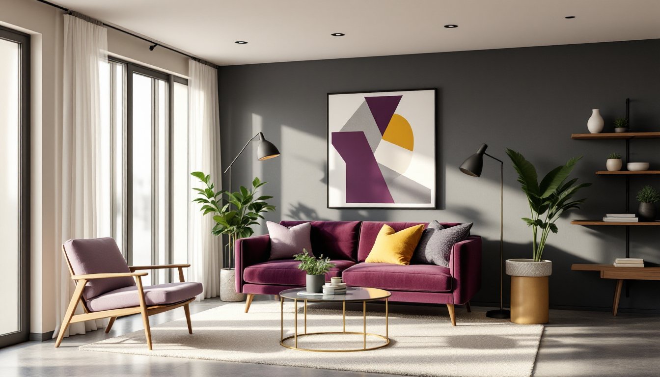
- Deep purple furniture like velvet sofas and ottomans create visual impact while hiding wear better than light neutrals, making them ideal for high-traffic households.
- Neutrals like charcoal gray, taupe, and soft white serve as the perfect foundation for purple accents, allowing the bold color to shine without overwhelming the space.
- Layered lighting with warm white bulbs (2700K–3000K) and fixtures in matte black or brushed brass is essential to showcase purple’s depth and prevent it from appearing dingy under poor lighting.
- Two-tone accent wall strategies—pairing deep purple with crisp white at chair rail height—create visual interest while maintaining the modern aesthetic without overpowering the room.
- Green plants and metallic accents elevate a modern purple living room from bold to sophisticated, with brass complementing warmer purples and brushed nickel suiting cooler tones.
Why Purple Is the Power Color for Modern Living Rooms
Purple occupies a unique position on the color wheel, it’s neither warm nor cool, which gives it remarkable flexibility in design applications. The color combines the stability of blue with the energy of red, creating a psychological effect that feels both calming and stimulating depending on the shade and context.
From a design perspective, purple works exceptionally well in modern spaces because it pairs naturally with the materials that define contemporary interiors: brushed nickel, matte black fixtures, concrete accents, and natural wood tones. Unlike trendy pastels that fade from style within a season, deeper purples have staying power. Aubergine, plum, and mauve have been appearing in high-end residential projects since 2023, and that momentum is building into 2026.
The color also photographs well, which matters for homeowners who document their spaces or eventually sell. Purple reads as intentional and curated, it signals that thought went into the design rather than defaulting to builder-grade beige. In open-concept layouts, a purple living room creates clear visual separation from adjacent kitchen or dining areas without requiring walls or dividers.
One practical advantage: purple hides wear better than lighter neutrals. Sofas in deep purple upholstery don’t show pet hair or minor stains the way cream or light gray does, making it a smart choice for high-traffic living rooms.
Choosing the Right Shade of Purple for Your Living Room
Not all purples are created equal, and picking the wrong shade is the fastest way to end up with a space that feels off. The decision starts with natural light exposure.
North-facing rooms receive cooler, indirect light throughout the day. In these spaces, warmer purples with red undertones, think burgundy, wine, or raspberry, prevent the room from feeling cold or gray. South-facing rooms get intense, warm light, so cooler purples like lavender, periwinkle, or violet balance that warmth without turning muddy.
For rooms with minimal natural light, lighter purples work better than deep shades. A mauve or dusty lilac keeps the space from feeling like a cave, especially if the ceiling height is under 8 feet. Save the drama of deep eggplant or royal purple for rooms with large windows or ample artificial lighting.
Saturation matters as much as hue. Highly saturated purples (the kind that look almost neon) rarely work in residential spaces, they’re too stimulating for areas meant for relaxation. Muted, grayed-down purples with lower chroma feel sophisticated and are easier to live with long-term. Think about how the shade appears on large surfaces versus a 2×2-inch paint chip: colors always read more intense when covering an entire wall.
Test paint samples on at least two walls, one that receives direct light and one in shadow. Live with the samples for 48 hours, checking them at different times of day. Purple is notorious for shifting appearance under incandescent versus LED lighting.
Modern Purple Furniture Selections That Make a Statement
A purple sofa is the most direct way to commit to the color, but it requires careful selection. For a modern aesthetic, look for clean-lined silhouettes, low-profile sectionals, tufted Chesterfields reinterpreted in velvet, or Scandinavian-style sofas with tapered wooden legs. Avoid overly ornate curves or traditional skirts, which read dated.
Velvet upholstery in deep purple tones (plum, aubergine, grape) works particularly well in modern spaces. The fabric has a natural sheen that changes with light angles, adding depth without pattern. Velvet also hides wear and resists pilling better than many synthetic blends. For households with kids or pets, performance velvets from brands like Crypton or Revolution offer the look with added stain resistance.
Alternatively, a purple accent chair creates impact without overwhelming the room. A single amethyst wingback or a pair of lavender mid-century lounge chairs flanking a fireplace provides color while keeping the sofa neutral. This approach offers more flexibility, swapping out chairs is easier and cheaper than replacing a sofa when tastes shift.
Purple ottomans and benches work as transitional pieces. A tufted purple ottoman can function as extra seating, a coffee table with a tray on top, or a footrest. It introduces color at a lower price point than case goods or upholstered seating.
When selecting wood finishes to pair with purple furniture, walnut and espresso create a rich, layered look. Light oak or ash provides contrast that keeps the space from feeling too heavy. Avoid honey oak or orange-toned woods, they clash with purple’s blue undertones.
Accent Walls and Paint Strategies for Purple Living Spaces
An accent wall is the lowest-commitment way to test purple in a living room. The standard advice is to paint the wall that naturally draws the eye, typically the one behind the sofa or the wall with a fireplace. But in modern design, there’s merit in painting the least expected wall to create visual tension.
Prep work determines whether the paint job looks professional or DIY. Start by filling any nail holes with lightweight spackling compound, sand smooth with 120-grit paper, then prime. Purple paint, especially darker shades, shows every surface imperfection. Use a high-quality primer like Zinsser Bulls Eye 1-2-3 or Benjamin Moore Fresh Start, cheap primer leads to uneven color coverage and wasted topcoat.
For deep purples (anything darker than a medium plum), plan on three coats for full coverage, especially over lighter existing paint. Use a 3/8-inch nap roller for smooth walls, 1/2-inch for lightly textured surfaces. Cut in edges with a 2.5-inch angled brush before rolling to avoid lap marks.
Two-tone strategies work well in modern spaces. Pairing a deep purple lower wall with a crisp white or light gray upper wall (split at chair rail height, roughly 32-36 inches) creates visual interest without overwhelming the room. The line should be level and sharp, use painter’s tape rated for delicate surfaces and remove it while the paint is still slightly tacky for the cleanest edge.
Matte and eggshell finishes suit modern aesthetics better than high-gloss. They minimize surface imperfections and create a softer, more sophisticated look. Reserve satin finishes for trim and doors to differentiate architectural elements.
Complementary Colors and Decor That Enhance Purple
Purple needs supporting players to shine. The wrong pairings turn a modern living room into a chaotic mess: the right ones create cohesion.
Neutrals are the safest foundation. Charcoal gray, warm taupe, greige, and soft white all allow purple to pop without competition. A charcoal sectional with purple throw pillows, or purple walls with a cream sofa, both work. For homeowners drawn to modern design trends, the neutral-plus-purple formula offers flexibility, neutrals ground bold color choices.
Metallic accents elevate purple from bold to luxe. Brass and gold pair beautifully with warmer purples (mauve, lilac, plum). Brushed nickel, chrome, and silver complement cooler purples (violet, periwinkle, lavender). This isn’t just about decor, consider switch plates, curtain rods, and light fixtures as opportunities to reinforce the metallic choice.
For a more daring palette, mustard yellow creates striking contrast with purple. Use it sparingly, a mustard throw blanket, a single accent pillow, or a piece of artwork. The combination feels retro-modern, nodding to 1970s design without feeling dated.
Green is purple’s complementary color on the color wheel, making it a natural pairing. Sage green or eucalyptus tones work better in modern spaces than bright kelly green. Live plants, a fiddle leaf fig, a potted monstera, or a snake plant, bring in green organically while improving air quality.
When selecting patterns, geometric prints in black, white, and purple keep the look contemporary. Avoid florals unless they’re highly stylized or large-scale abstracts. Resources like Design Milk often feature modern pattern applications that balance bold color with clean design.
Lighting Tips to Showcase Your Purple Living Room
Purple is notoriously sensitive to lighting, it can shift from regal to dingy depending on the light source. Getting the lighting right isn’t optional.
Color temperature matters more with purple than almost any other hue. Bulbs rated at 2700K to 3000K (warm white) bring out red undertones in purple, making it feel cozier. Bulbs at 4000K and above (cool white or daylight) emphasize blue undertones, which can make purple feel cold or gray. For living rooms, stick to the warmer end unless the space gets abundant natural daylight.
LED bulbs have improved dramatically, but not all are equal. Look for bulbs with a CRI (Color Rendering Index) of 90 or higher. Lower CRI bulbs distort color perception, making purples look flat or off-tone. It’s worth spending a few extra dollars per bulb, the difference is visible.
Layered lighting is essential in a modern purple living room. Start with ambient lighting (overhead fixtures or recessed cans), add task lighting (floor lamps near seating, table lamps on end tables), and finish with accent lighting (picture lights, LED strips behind shelving, or uplights in corners). This approach prevents the room from feeling one-dimensional.
Dimmer switches offer control over intensity and mood. Install a dimmer on overhead lights, a space that looks great at 70% brightness during evening hours might feel too intense at full power. Most LED bulbs are now dimmable, but confirm compatibility before installation to avoid flickering.
For homeowners looking at contemporary lighting designs, consider fixtures in matte black or brushed brass to complement purple walls or furniture. Avoid chrome or polished nickel in rooms with cooler purple tones, they can create a clinical feel.
Conclusion
A modern purple living room isn’t a risk, it’s a calculated design decision that pays off when executed with attention to shade selection, complementary colors, and proper lighting. Start with one element, whether that’s an accent wall, a statement sofa, or a collection of decor pieces, and build from there. Purple’s versatility means it adapts to evolving tastes: accessories and paint are easy to change if preferences shift. The key is committing to quality materials and thoughtful placement rather than scattering purple randomly throughout the space.