
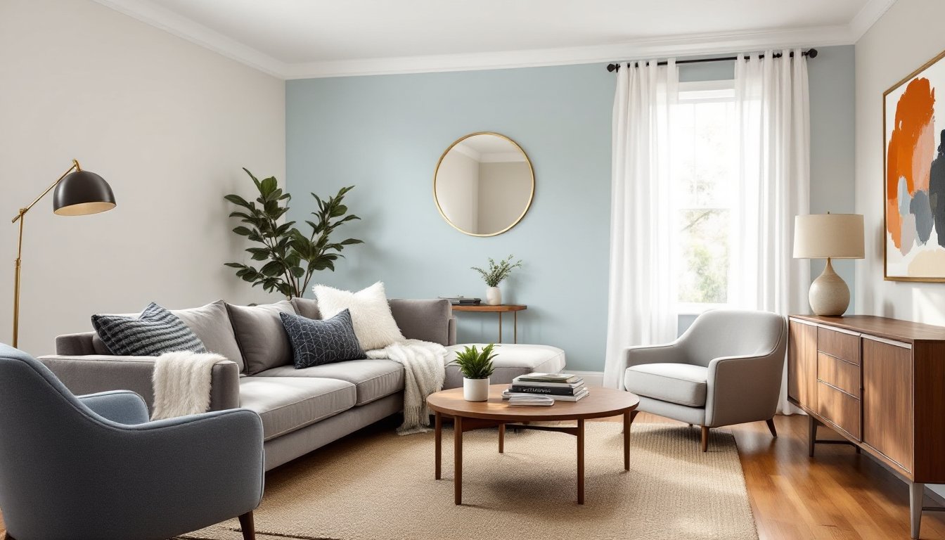
Light blue and grey create one of the most versatile, calming color palettes for living rooms. The combination works across styles, coastal, modern, traditional, even industrial, without feeling locked into a single design trend. These two neutrals offer enough contrast to add visual interest while maintaining a cohesive, airy feel. Whether refreshing a rental with new throw pillows or committing to a full repaint and furniture swap, this palette gives plenty of room to adjust intensity, pattern, and texture. The key is balancing cool tones with warm accents and choosing shades that complement existing light conditions and architectural features.
Table of Contents
ToggleKey Takeaways
- Light blue and grey create a versatile, calming palette that works across coastal, modern, traditional, and industrial design styles without feeling trendy or dated.
- Cool grey and light blue tones make rooms feel larger and less cluttered while reflecting light effectively, making them ideal for smaller spaces or rooms with limited natural light.
- Test paint samples on walls receiving both direct and indirect light for at least a week, as colors shift dramatically based on your specific lighting conditions before committing to a full repaint.
- Anchor the room with a grey sofa and use blue upholstery as accent pieces (armchairs, ottomans) to prevent overwhelming smaller spaces with too much color.
- Balance the cool blue and grey palette with warm accents like brass fixtures, natural wood tones, layered lighting, and varied textures (velvet, linen, jute) to prevent the room from feeling cold or flat.
- Use warm white bulbs (2700K–3000K), multiple light sources, and window treatments in white or cream to create depth, prevent a clinical feel, and enhance the airy quality of light blue and grey living room ideas.
Why Light Blue and Grey Work Beautifully Together
Light blue and grey share a cool, neutral base that prevents clashing. Both colors recede visually, making rooms feel larger and less cluttered, a major advantage in smaller living spaces or rooms with limited natural light. Grey anchors the palette, providing a sophisticated neutral that doesn’t read as stark white or beige. Light blue introduces softness and a hint of color without overwhelming the space.
This pairing also reflects light well, particularly matte and eggshell finishes. In rooms with north-facing windows, the coolness can feel too stark: balance with warm wood tones, brass fixtures, or cream accents. In south-facing rooms, the palette stays fresh without turning icy. The combination naturally complements white trim, which is standard in most homes, and works with both painted and natural wood flooring.
From a practical standpoint, both colors hide minor wall imperfections better than pure white, and they don’t show scuffs as readily as darker tones. Touch-ups blend more easily, and the palette ages well, no risk of dated jewel tones or trendy accent walls that look off in five years.
Choosing the Perfect Shades of Blue and Grey
Not all greys and blues play nicely together. Greige (grey with beige undertones) pairs well with slate blue or powder blue. Cool greys with blue undertones match sky blue, robin’s egg, or pale aqua. Avoid pairing warm greys with icy blues, they’ll fight each other and make the room feel unbalanced.
Test paint samples on at least two walls: one that receives direct light and one in shadow. Colors shift dramatically based on natural and artificial light. A blue that looks serene in the store can read purple or green under your specific lighting. Let samples dry fully: wet paint always looks darker.
Popular combinations that work:
- Pale grey walls (like Repose Gray or Classic Gray) with soft sky blue upholstery, keeps the space open and airy
- Light blue walls (Breath of Fresh Air or Palladian Blue) with charcoal grey furniture, adds contrast without going stark
- Greige walls with dusty blue accents, brings warmth while staying in the cool-toned family
For renters or anyone hesitant about paint, test the combination with removable peel-and-stick samples or large poster boards painted in your chosen shades. Live with them for a week before committing to gallons of paint.
Wall Color Combinations and Paint Ideas
A single light blue on all four walls works in rooms with strong architectural interest, crown molding, wainscoting, or built-in shelving. In plainer rooms, consider a two-tone approach: light grey on three walls and a slightly deeper blue on the accent wall behind the sofa or fireplace. This adds depth without requiring bold color.
Prep is critical for even color. Fill nail holes with lightweight spackle, sand smooth with 120-grit paper, then prime with a tinted primer (grey-tinted for grey paint, blue-tinted for blue). Standard white primer can require three coats to achieve true color, especially with lighter blues that tend to look washed out.
For textured walls (common in older homes or popcorn ceiling removal projects), a matte or eggshell finish hides imperfections better than satin. One gallon of quality paint typically covers 350–400 square feet with one coat. Most living rooms need two coats for full coverage, so budget accordingly.
Trim and ceiling considerations:
- Keep trim bright white or soft white, it frames the cool tones and prevents the room from feeling too monochrome
- Paint ceilings a shade lighter than the walls (or pure white) to maintain height
- If using blue on walls, a pale grey ceiling can add subtle dimension without feeling heavy
Avoid high-gloss finishes in living rooms. They highlight every wall flaw and create glare from lamps and windows. Stick with matte, eggshell, or satin depending on cleanability needs (eggshell wipes down more easily in high-traffic homes).
Furniture and Upholstery Selections
Anchor the room with a grey sofa, charcoal, dove, or medium grey all work. Fabric choice affects the vibe: linen and cotton blends feel casual and coastal, while velvet or wool adds formality. Performance fabrics (treated with stain resistance) are worth the upcharge if kids, pets, or frequent entertaining are part of the picture.
Blue upholstery works best as an accent: a single armchair, ottoman, or loveseat in powder blue, slate, or denim tones. Going full blue on a large sofa can overpower smaller rooms. If choosing blue for the main seating, keep walls neutral grey and bring pattern in through pillows and throws.
Wood furniture tones matter more than most people realize. Walnut and medium oak bring warmth that balances the cool palette. Avoid grey-washed or whitewashed wood, it flattens the room and kills contrast. Black metal frames (on coffee tables, shelving, or floor lamps) add modern edge, especially in industrial or Scandinavian-leaning spaces.
Examples of classic blue and white interior styles show how varying furniture finishes and upholstery weights shift the mood without changing the core palette. Mixing materials keeps things from feeling too matchy or sterile.
Accent Pieces and Decorative Touches
Accents prevent a blue and grey room from reading flat or cold. Start with throw pillows in varied textures: linen, velvet, cable knit, or faux fur. Mix solids with subtle patterns, stripes, geometric prints, or small-scale florals. Avoid overly busy patterns that compete with the serene palette.
Rugs ground the space. A natural fiber rug (jute, sisal, or seagrass) adds texture and warmth without introducing new color. Alternatively, a patterned rug with blue, grey, and cream ties the palette together and hides dirt better than solid colors. Aim for a rug large enough that at least the front legs of all seating pieces rest on it, this visually anchors the furniture grouping.
Warm metallics (brass, copper, gold) offset the cool tones beautifully. Picture frames, lamp bases, cabinet hardware, and curtain rods in warm finishes add just enough contrast. Avoid mixing metals haphazardly, pick one primary and one secondary finish and stick with them throughout the room.
Artwork and wall decor offer another opportunity for balance. Abstract pieces with warm undertones (rust, terracotta, blush, mustard) bring energy without clashing. Black-and-white photography stays crisp and classic. Avoid overly matchy decor, like solid blue or grey canvases that just repeat wall color. Many modern home design platforms showcase layered, curated looks that balance color with negative space.
Greenery works universally. Potted plants or fresh-cut stems add life and a hint of natural color that complements any shade of blue or grey.
Lighting and Texture to Complete the Look
Lighting can make or break a cool-toned room. Warm white bulbs (2700K–3000K) prevent the space from feeling clinical. Cool white or daylight bulbs (5000K+) amplify the blue and grey, often making the room feel colder than intended. Use dimmable LEDs to adjust mood from bright task lighting during the day to softer ambient light in the evening.
Layer lighting sources: overhead (recessed or a statement pendant), task (floor lamps next to reading chairs), and accent (table lamps on side tables or shelving). A single overhead fixture leaves the room flat. Three to five light sources in a standard-sized living room create depth and flexibility.
Texture is the secret weapon in monochromatic or limited-palette rooms. Mix smooth (leather, polished wood, glass) with tactile (chunky knits, linen, woven baskets, nubby upholstery). Texture creates visual interest even when color is restrained. A grey linen sofa, blue velvet pillow, jute rug, and brass lamp base all bring different surface qualities that keep the eye moving.
Window treatments affect both light and texture. Linen or cotton curtains in white, cream, or soft grey diffuse natural light and soften hard edges around windows. Avoid heavy, dark drapes unless the room gets harsh afternoon sun. Hang curtain rods close to the ceiling and let panels just skim the floor, this adds height and makes windows feel larger.
For additional inspiration on how texture and lighting choices influence various design styles, exploring interior design galleries can provide real-world examples of layered, functional living spaces.
Conclusion
Light blue and grey deliver a flexible, timeless palette that adapts to personal style and practical needs. Success comes down to balancing cool tones with warm accents, layering texture, and choosing the right shades for your specific light conditions. Whether tackling a weekend refresh or a full renovation, this combination offers room to grow and adjust without starting from scratch.